redesigning the consultation page at make.org: a case study in driving engagement
At Make.org, our mission is clear: to put citizens back at the heart of democracy and revive civic dialogue. Through large-scale civic consultations, we empower citizens to engage with critical societal issues, from combating violence against women to addressing environmental challenges. These consultations attract tens of thousands of participants, sometimes exceeding half a million, who propose solutions and vote on ideas submitted by others.
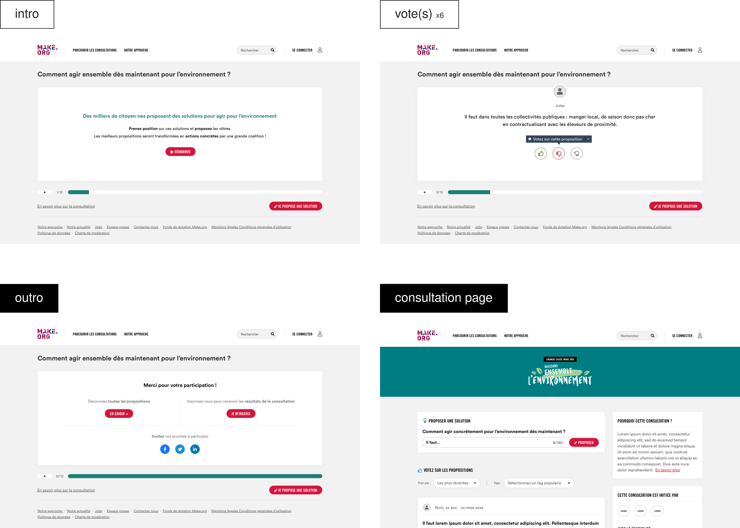
Central to this experience is the Consultation Page, where users can gain deeper insights into the topics they’re engaging with and explore additional solutions. However, we identified critical challenges that were limiting its potential, prompting us to rethink its design and functionality.

The Challenge: Addressing Engagement Gaps
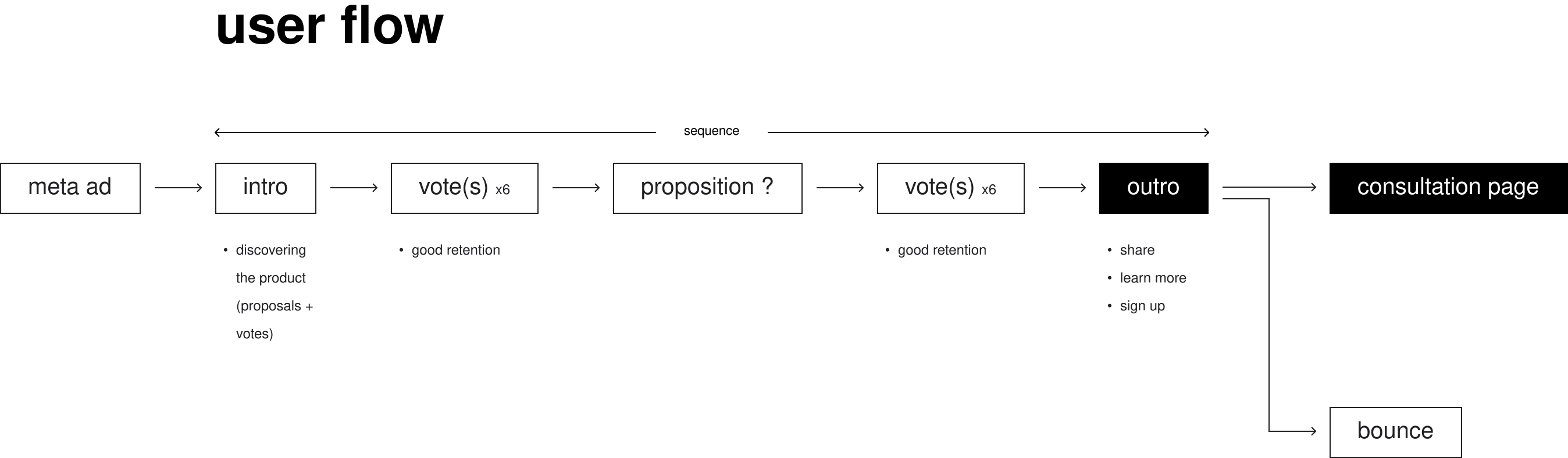
Our user journey begins with acquisition campaigns, primarily through Meta ads, that drive users to what we call "the sequence." In this sequence, participants vote on 12 proposed solutions, submit their own ideas if they wish, and are then presented with several paths forward at the end of the flow—the Consultation Page being one of them.
Despite strong engagement within the sequence itself (76% of users who start the sequence complete it), the transition to the Consultation Page revealed areas for improvement.
Objectives
Our redesign aimed to:
- Reduce Bounce Rates: Improve the transition from the sequence outro to the Consultation Page.
- Maximize Engagement: Increase the number of votes and solutions submitted to optimize our ad spend ROI.
- Build Loyalty: Encourage more sign-ups for long-term engagement with future consultations.
Defining the Approach
Our process began with a comprehensive analysis to understand the problem and define success metrics. We combined quantitative data with qualitative insights to identify actionable opportunities.
Data Analysis
- Strong retention through the sequence, with 76% completion rates.
- Low Conversion: Only 20% of users at the end of the sequence took any action
- Of these, 70% visited the Consultation Page, contributing an average of 12 additional votes.
- However, the overall bounce rate was 60%.
- Limited Loyalty: While 30% of users signed up for consultation results, retention efforts were hindered by our dependence on Facebook for acquisition.
User Research
We conducted five user interviews to observe participant behavior and gather feedback on their decision-making process at the outro stage. Key findings included:
- Users often felt unsure about what to do next.
- The purpose of the Consultation Page and its value were not immediately clear.
- Too many options at the outro created decision fatigue.
Ideation: From Insights to Solutions
To address these challenges, we brought together a cross-functional team from design, product, tech, data, and on-demand consultations for an ideation workshop. Using techniques such as How Might We, Lightning Demos, and Crazy 8s, we explored potential solutions.
Key Ideas Generated
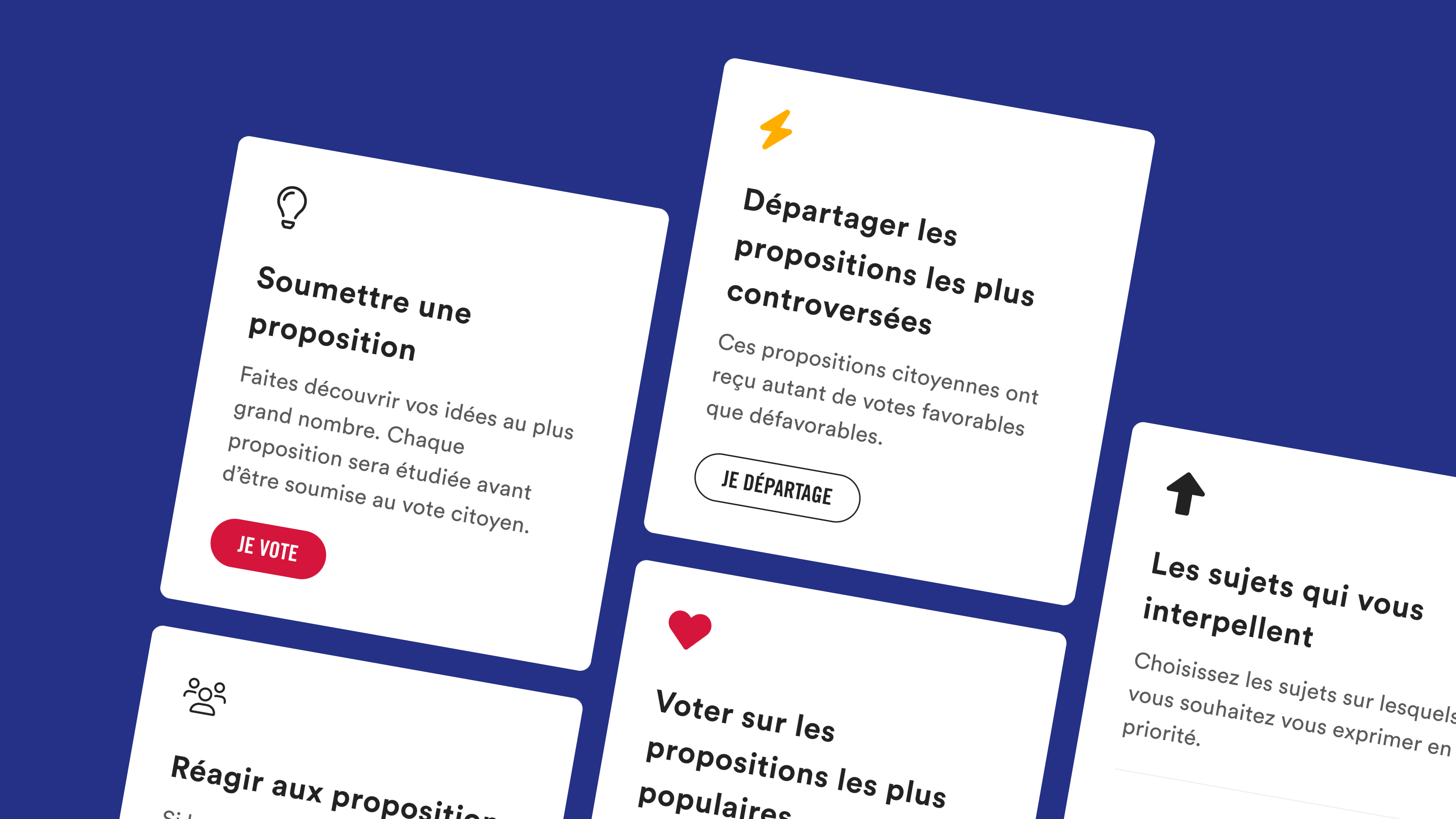
- Personalization: Incorporate elements such as participation stats or gamification to highlight the user’s role in the consultation.
- Community Impact: Showcase preliminary consultation results or trends to emphasize the collective effort.
- Improved Clarity: Simplify the outro experience and provide clearer guidance on next steps.
- Contextual Relevance: Enhance the Consultation Page with additional context to deepen user understanding and encourage sign-ups.
Prototyping and Testing
We developed prototypes incorporating these ideas and conducted seven user tests to evaluate usability and gather feedback. Participants were asked to think aloud while navigating the redesigned outro and Consultation Page.
Key Insights
- While personalization features like participation stats initially seemed promising, users found them confusing and struggled to interpret the data. This diminished their overall experience, leading us to remove these elements.
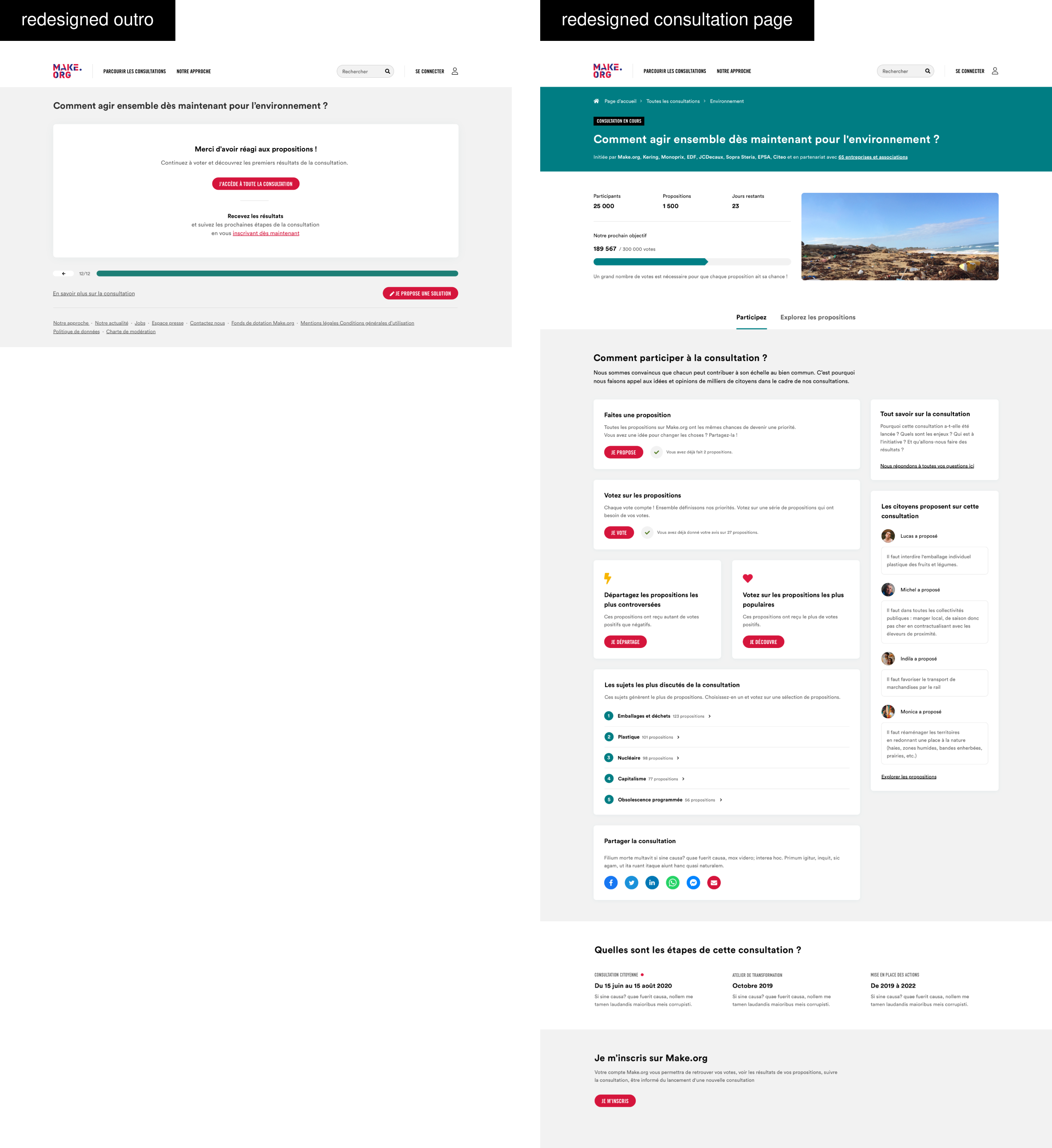
- Simplifying the outro by reducing the number of options significantly improved clarity and engagement.
- Providing more contextual information about the consultation helped users better understand its value and motivated them to sign up for updates.
Results: Simplification Drives Success
The redesigned Consultation Page and streamlined outro yielded measurable improvements:
- Outro-to-Consultation Transition: Increased from 20% to 72%.
- Average Votes: Doubled from 12 to 24 votes per user.
- Engagement with Controversial Proposals: Significantly higher, demonstrating the impact of clear guidance and relevant context.
Key Takeaways
- Simplification Is Powerful: Reducing cognitive load at key decision points can dramatically improve user engagement.
- User Testing Matters: Observing real user behavior revealed critical gaps that might have gone unnoticed with assumptions alone.
- Context Builds Value: Providing relevant, concise information fosters deeper understanding and long-term engagement.
This project highlights the importance of user-centered design in driving meaningful engagement. By addressing the specific needs and behaviors of our audience, we were able to align our solutions with Make.org’s mission of empowering citizens to take an active role in democracy.